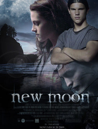
Okay, so last week I posted what I thought was the official poster for the upcoming release of New Moon. And the only reason I thought that was because it was SO well done. It totally looked like an official studio poster (and I used to work for a movie studio!). But I was quickly made aware by a knowledgeable blog commenter that it was in fact, a fan poster. And then I was made aware by another knowledgeable blog commenter that there are tons of other cool fan-made posters out there as well. So that got me thinking...why not post some of the really good ones and have everyone pick their favorite! (And yes, I realize I'm not the first person to come up with this idea!) So I scoured the internet for (what I think are) the ten best fan made posters out there right now ("best" meaning the most professional looking and studio-worthy).
Please vote for your favorite in the poll below!
**Also, unfortunately because these posters are posted all over the web, I don't know the names of all the talented artists who created them. So if you see your poster here, please comment and tell me who you are and if you have a website so I can give credit where credit is incredibly due.
#1: Half-Wolf Jacob by
MPGraphics 
#2: Bella/Edward Clocktower by MPGraphics

#3: Wolf Howling

#4: Bella/Jacob Cliff Background

#5: Bare-chested Edward
#6: Never Existed 
#7: Love Triangle 
#8: Edward/Bella Split 
#9: Bella in the Fog
10: Bella in Bed
Vote Here!


8 comments:
just read evermore and cant wait till second book!
Bare chested Edward please!!
Thanks, Anonymous!
Honestly, I think having the JUST Edward one, is a bad choice...because
a) its not just about edward
b) Jacob Black IS ACTUALLY the main character to new moon (main focus)
and c) Edward is only in half of new moon.
I voted for 5 (jacob bella cliff scene). I felt it portrayed the book more. The other posters have to much Edward, he has to small of a role to be the main focus in the poster.
Oops I mean 4 not 5.
I love the Bella in the Fog one. That one is just gorgeous (even if it isn't a real poster)
And number 3. I think. Hmmm...
Hi Tina,
I agree about what you said about Edward. He's hardly in this story! Although I know Summit is going to find a way to make him more involved. But looks like barechested Edward is winning so far. Do you think that's just because of the skin showing???? :)
I really think that the first one should be used for Eclipse. The poster should embrace the whole story. Not just part of it. The one with edward topless just covers the ending. I think that If Edward is in it, So does Jake. Because of that fact that it mainly concerns Jacob and Bella, But Edward was the cause. So he has to have some part of it, but a small sorta like faded part of the poster.
Post a Comment